Pàu brand identity 2.0.
What we did
The Case
Somewhere at the beginning of 2020, the covid19 pandemic introduced itself to our daily lives causing all activities to slow down. We launched a campaign to encourage our clients to rethink, reboot, and reimagine. We took this opportunity at Pàu to do the same and reflect on previous years and set new goals for 2025. We thought about what will shape our future and adapt our vision to new realities.
While creating these goals we realized that the upgrade of our branding was long due. Over the years, Pàu has experienced strong and solid growth not only as a company but also in the quality and quantity of projects it realized. From a design point of view, we decided to seize the opportunity to extend this professionalism and maturity into a rebranding and launch a complete and well-considered brand identity in 2021.
So walk the talk, practice what you preach, eat your own dog food, or how does the saying go again? We've put a small team together to get things started.
Design process
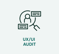
Design audit
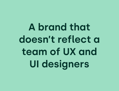
It didn't take long to discover a whole range of inconsistencies and design errors. And above all, a design that no longer reflected our values, standards, and personality of Pàu.
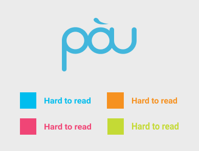
The old branding consisted mainly of 4 colors which didn't match our professionalism & maturity and weren't meeting today's accessibility guidelines. Apart from those colors, the branding included a whole range of illustrations, shapes, and icons that were used inconsistently throughout different touchpoints. The logo was still acceptable but could definitely use an upgrade.
The result of the design audit was a list of things we could improve, change, or even ditch. Time to start thinking about concepts and directions to avoid tweaking and nudging without a clear goal.
Evolution over revolution
Before diving into the design exercise we had to define a clear direction for the rebranding. A very important question arose. Evolution or revolution?
We have opted for evolution as we want to remain at the core of who we are and build on the strong foundations we have already laid so far. Our "People First" approach and human character have been around since the start of Pàu. It echoes the halls of our offices. Not only because we invest highly in personal development but also because we see users and stakeholders as main players in each project we tackle. It will always remain woven in everything we do.
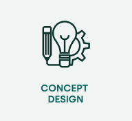
Design exercise
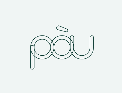
We started off the exercise by tweaking the old logo. We kept the idea of connecting the letters and added a modern look and feel by using geometric shapes and outlines instead of using the existing font. These bases form the perfect analogy with what we do on a daily basis. Drawing the lines and connecting the dots for our clients. It instantly became one of the main building blocks.
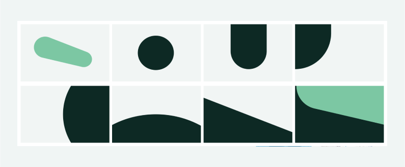
The geometric character and outlines of the logo inspired us to further develop the rebranding in this direction. We used parts of the logo as shapes to create new elements. This way all the elements are derived from the same source and maintain a strong connection with each other. Both in the conscious and unconscious experience.
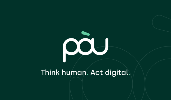
We also defined a new set of colours with a strong focus on our People first culture. We opted for green as it connects us with nature which is the biggest force in life. It also radiates calm. As we work in a digital field we gave a wink to the tech world by also adding a bright colour in the colour palette. The swoosh in our logo was the perfect element to apply this colour to.
Typography often doesn’t get the right amount of attention. However, it is a core element of every branding. We chose fonts in which the characteristics are reflected and form a beautiful whole.
In the end, it all came together. The fact that we draw the lines for our clients, give substance to their needs and add an accent on the work we do is now in one way or another intertwined in our rebranding.
Think human. Act digital.
Besides colors, fonts, and shapes, we wanted to have a powerful baseline that emphasizes the human aspect in our digital work field. It is a strong reminder for ourselves that even in a digital world we want to stay human. The baseline also reflects how we create user-centered digital products. By thinking and doing.
Outcome
After a few months of hard work we’ve finalised the design exercise. A new balanced and accessible colour palette, a modern touch to the logo, a very strong baseline, concrete but also aspirational content are among the ingredients of our rebranding.
Last but not least. For a rebranding to succeed it needs to survive when it is applied to all the different touch points you use as a company. Consistency is king and better perfect than done.
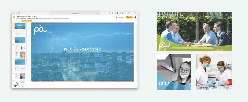
The end of this intensive and insightful period was accompanied by the launch of our new website along with all other online applications and offline swag. From email templates to car stickers to bike jerseys. We've covered it all.