
Accessibility 101 pt. 1.
More than a billion people in the world live with some form of disability, nearly 200 million of whom experience significant difficulties in functioning. Around the world, people with disabilities have poorer health outcomes, lower educational achievement, less economic participation and higher poverty rates than people without disabilities. This is partly because people with disabilities experience barriers in accessing services that many of us have long taken for granted, including health care, education, employment and transportation, as well as information.
Everyone can therefore contribute to reducing these barriers. In our sector, this starts with a user-friendly AND accessible website. Applying a few things correctly will go a long way.
Alternatives to non-text content
Non-text content is things like images and videos. Visually impaired users are not interested in this, so you can ensure that your images / videos are not necessary to understand the content or you can provide an alternative, such as an ALT text, Alt text (or alternative text ) is used in HTML code to describe the image so that visually impaired users have enough information to understand everything. The ALT text can thus be read out by a screen reader.
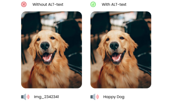
Unfortunately, the ALT text is not yet used as it should in many places, so let's see how it should be done.
Describe specifically what is in the image:
When writing alt text, it must contain sufficient information; if you close your eyes and someone reads it to you, you should be able to imagine the image very accurately.
Now suppose you have an image of a landscape. For example, you could write:
<IMG SRC=”LANDSCHAP.JPG” ALT=”LANDSCHAP”>
Although this is much better:
<IMG SRC=”LANDSCHAP.JPG” ALT=”GROEN LANDSCHAP MET HEUVELS EN DENNENBOMEN”>
Also keep it short but clear. You could describe the image in detail; but the question then remains whether this will have added value for the end user.
Don't forget your buttons either! These must also have an ALT text. You do not have to tell what the button looks like in scents and colors, but it is sufficient to describe the function of this button. For example: register, unsubscribe, send, ...
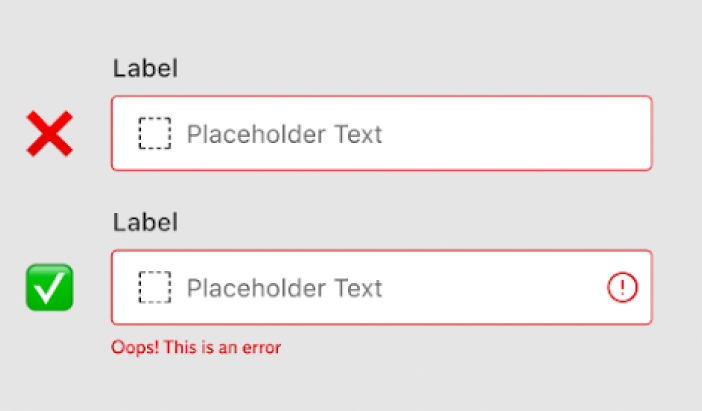
Use of color
Color should never be the only way to convey something. For example, it is of little use to color an entry field red if an error occurs. Provide text that clearly shows what exactly the problem is.
Animations
Animations provide a high-level feeling when you want to propose something, GIFs provide a playful touch to presentations and introductions. But that's not the case for everyone.
For people with concentration problems, unnecessary movements can cause the focus to disappear to the initial goal and the user simply leaves your tool or website.
Does this mean you should ban all movement from your digital tools? Absolutely not, animations can be very useful if they actually offer added value. For example, transformations with buttons remain a handy indication when an action is performed and instructions can often be made clearer if steps are animated.
If you still want to add animations, make sure that the user can easily turn them off if he/she wishes.
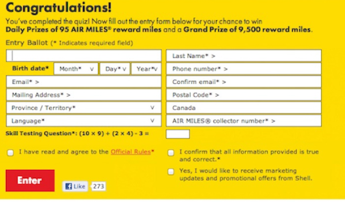
Forms
Forms can often be more complicated than necessary. For example, users with anxiety disorders can easily be triggered by unclear error messages or oversimplified messages.
Also make sure your form doesn't need too many instructions, if it does, it's not a good form. You can assume that instructions are rarely if ever read. A bit like Terms of Agreement.
For example, products are more often returned because they are not user-friendly than they are returned because they do not work. If there is a field that needs more information, it is best to put the instructions next to that field and not at the very top.
These are just a few of the things you can do to make browsing more enjoyable for your users. And as small as they seem, they make a big difference to many of us.
Sources:
World Report on Disability by World Health Organization
WCAG (https://www.w3.org/WAI/GL/wiki/Main_Page)