What is a UX design portfolio?
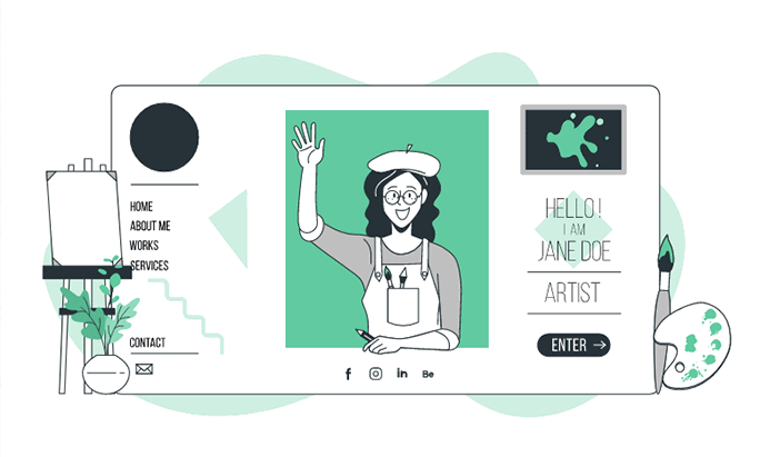
UX designers use UX portfolios to showcase their design process, knowledge, and skills to get hired by a new client.
The primary purpose is to get hiring managers interested, and your UX portfolio is a tool for the first step in the hiring process. A UX design portfolio is arguably even more important than your CV.
Hiring managers want to see who you are as a person. What you can do, what part of UX you specialise in, how you work and how you think. Many recruits evaluate your portfolio based not only on the content of your UX case studies but also on the standard of your design.
The most important thing you can do to ensure your UX portfolio grabs attention, regardless of your level, is show your process.
A typical mistake I have seen in many portfolios is that designers don't show what process they have followed in creating their UX design portfolio and only showcase high-fidelity prototypes.
What are hiring managers looking for?
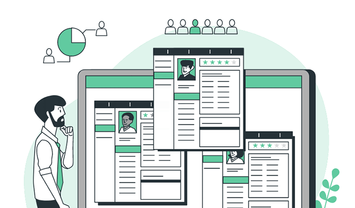
Many hiring managers will spend less than 5 minutes seeing whether you're a good fit for what they are looking for, so your portfolio must be scannable and readable. Ensure your portfolio is easy for the hiring manager to consume.
- Easy to read, skim and scan
- Depending on your skill level with visual design, your portfolio should look more or less refined.
- There is no excuse for having a portfolio that does not look professional.

Junior designer.
- The hiring managers want to see the process you took to get to the final stages of your design. They do not want to see your final deliverables.
- How did you think through your problems?
- Proof of your skills and knowledge.
- Do not only show high-fidelity mock-ups or prototypes.
- You should try and include 2-3 case studies in your portfolio.

Mid or Senior-level designers.
Hiring managers want to see skills that go beyond making designs and deliverables.
- Team management
- Design advocacy for your peers, clients, stakeholders or customers.
- Showcasing your facilitation of any workshops to foster collaboration.
- Business analysis skills and mapping your user experience solutions back to business goals.
- Stakeholder management.
What type of format should you use for your portfolio?
Online and PDF portfolios serve different purposes. You will often use your online portfolio to apply for jobs and only send PDF portfolios to interested hiring managers.

Online portfolio
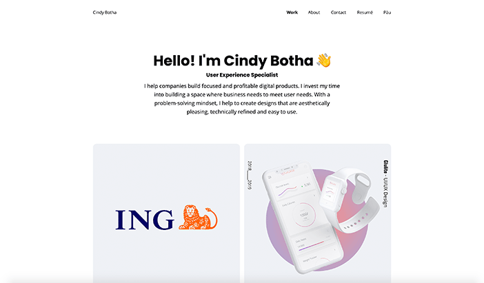
You want your website to capture the attention of hiring managers. Your online portfolio gives hiring managers a quick overview of your abilities. An Online portfolio also helps you get discovered more quickly, which is standard practice for UX designers. Your website should tell people who you are, your skills and what you are looking for. It should provide a preview of your work and the projects you have worked on. It would help if you used it to apply for job openings. Your online portfolio should have a clear call-to-action button and links to your Linkedin or other social media accounts.
Potential website tools to use:
For my portfolio, I use https://uxfol.io/ because they provide: UX portfolio templates, UX case study generator, stunning galleries for your UIs, auto-generated device mockups, and copywriting help. They also have community and expert feedback to review your case studies.
PDF Portfolio
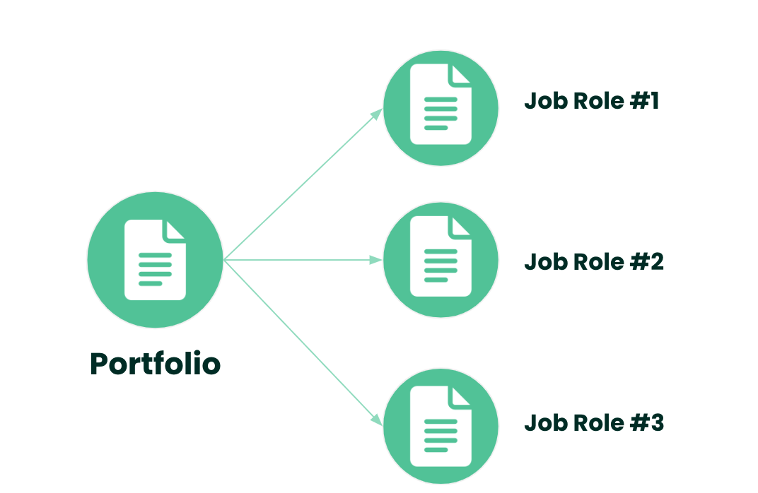
You will use your PDF for job interviews and in the later stages of the hiring process. It would be best if you tailored your PDF portfolio to each job role and position you apply for. Your PDF portfolio tends to showcase more in-depth detail of your case studies, and you can give a detailed and lengthy explanation of your design process. It is better to remove irrelevant UX case studies from your portfolio.
Tailor your PDF portfolio to each job role and position you apply for.
- Add or remove projects based on the role.
- Change the order of projects
- Changing the tile of projects, so specific skills are highlighted.
Potential tools you can use.
- Powerpoint
- Keynote
- Illustrator
- Sketch

Skeleton outline guide
- Cover page. You should include a hero image, your name, current job and title. Here, you may also want a short bio and links to your social media accounts.
- About you. Your skills, knowledge, training and current position.
- UX case studies. Here you will select and showcase projects you're proud of and explain your design process from start to finish.
- Contact details
Your PDF portfolio should be accessible on most devices. You should also ensure that your portfolio is in read-only mode. Upload your PDF portfolio to a cloud service such as dropbox or google drive. This way, you can send hiring managers a link to your PDF portfolio whenever needed.

Choosing the projects for your portfolio
Ask yourself which projects provide the best representation of your skills. Does the project represent the range of industries you have worked in?
The number of projects.
There is no correct number of projects, but your projects must reflect your skills. I would recommend having a minimum of 2 projects.
Always put your best projects first.
As mentioned earlier, hiring managers might only have 5 mins to read through your portfolio and might only make it through the first project. You want to ensure that they see your range of skills and that you have done everything to put your best foot forward.
UX Case studies
A UX case study is an example of your design work to give hiring managers vital insights by telling compelling stories in text and images to show how you have handled problems, showcasing your skills and your way of thinking. Your case study should be relevant to the job role for which you want to apply for. Your case studies should demonstrate the initial stage of empathizing with the users to the final stage of creating a prototype.

Introduction
Give the hiring manager reading your case study the most important information first to help them understand what project you worked on.
- What is your project about, and the type of project?
- What was your problem statement? What motivates you to take on this problem? Highlight the key issue you will solve, preferably in relation to business objectives or metrics.
- What were your team's primary goals?
- What was your solution, and ran through the approach to solving the problem. Give your readers a taste of what to expect in your case study.
- What was your role, and how did you contribute to the project?
- What is your team structure?
- What were the timelines, scope and constraints?
- Skills and area of focus.
- Tools used
Middle
Illustrate how you solved the problem stated in the introduction. Show your design thinking process; you should straightforwardly present them in your case study. You should show your approach, process and strategy and take the hiring manager through your journey from starting point to end goal.
- Explain the what, the how and the why of your steps. It's not enough to show what you have created. For example, affinity diagram. It would be best if you mentioned how you did it (e.g. miro board with all stakeholders)
- Use images or screenshots whenever appropriate. This will make your case study more readable.
- Make sure that your process is scannable. I mentioned earlier that hiring managers might only spend 5 minutes on your portfolio. They might only scan headings and should get a good idea from that.

Conclusion
- What was the final result of your project?
- Show the final product.
- Reflection on what you have learnt doing this project. (e.g. what lessons did you learn, what were the main challenges in the project and how did you handle it)
- What was the resolution? You should answer what you wrote in the introduction?

Showcase your work and process through visuals
Now that you have the content and story of your project. It is time to add visual elements, examples, and a representation of what you did. By visuals, you should include visual artefacts such as customer journeys; user flows, wireframes, screens, interfaces, etc.) When you think of visuals in your case study, you might want to jump straight into beautiful images of your final designs. Your case study should showcase your journey from the problem statement to the final design. Showcase your progress through your visuals. You must explain your visuals and add context.
- Adding titles
- Zooming or cropping to sections of visuals
- Annotating and explaining specific parts of visuals
- Use charts and graphs to visualize the results of your user research.
- Draw timelines and journey maps to summarize your design process.
Always remember to photograph and document your design process.
Make sure every single visual you include helps tell the story of your project.
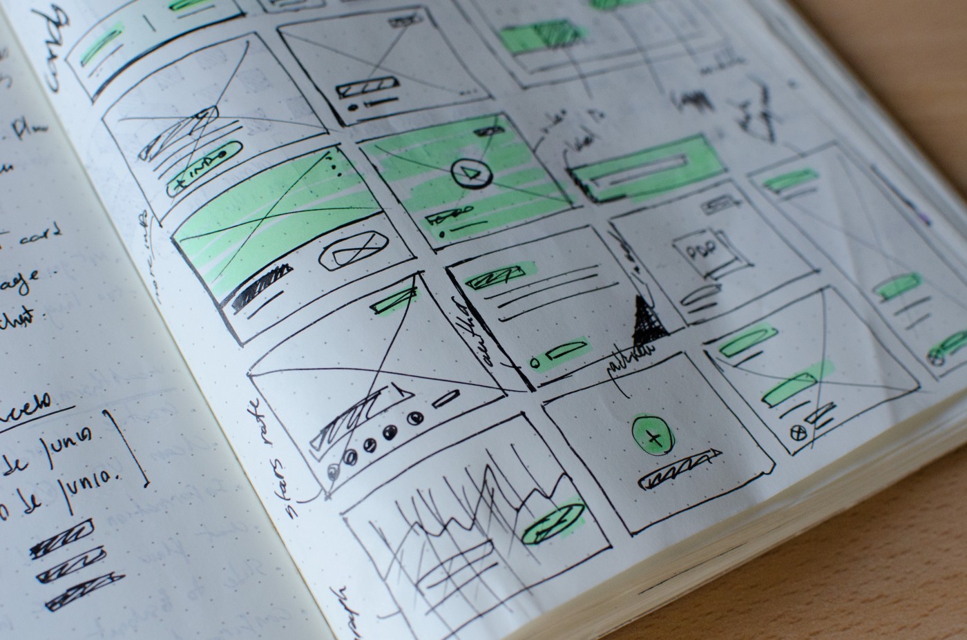
Don't add visuals for the sake of adding a visuals
What is the visual communication and adding to this project? Are the artefacts clear and readable?
Presentation tips for your UX portfolio
- Your portfolio has to look good.
- A visually pleasing portfolio is essential. Pay attention to your colour palette and fonts.
- Stick to a colour theme
- Annotate your portfolio, don't make it too text-heavy.
Recommended training for your UX portfolio
How to create a UX portfolio - Interaction Foundation
https://www.interaction-design.org/courses/how-to-create-a-ux-portfolio
UX Portfolio Formula - Sarah Doody
https://www.uxportfolioformula.com/ux-portfolio-formula/
Build a powerful UX Portfolio - Joe Natoli
https://learn.givegoodux.com/p/uxportfolio
I hope this article helps you to create your next UX portfolio.

