Why Figma is the ultimate design tool and why I would recommend it to everyone.
“There is an ultimate design tool”, said no designer ever. Any tool can bring you the necessary result: deliver a requested design, so it can be built. You can do this with pen and paper, an advanced program, PowerPoint, or even with MS Paint. If it’s possible to use an intuitive design tool that specifically helps us to create user interfaces, it makes our work even more fun and efficient, allowing us to focus more on the creative aspect. A win-win for us and the customer.
The Ecosystem of Tools
Sketch was a preferred design tool. What Photoshop and Illustrator does for print, for creating digital user interfaces, Sketch was the perfect tool. But it quickly proved to have its flaws. The distribution of these elements over different tools result in lower performance. As a designer you have a large package of tools, and you are dependent on synchronizations. If one tool decides to release an update, the other tools can become unusable, and syncing between them takes time that we don't have.
One tool to rule them all
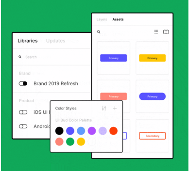
I tried out Figma on a project at a client's website. Now, we could work simultaneously on designs with a team. Libraries with design assets synced in seconds and could be used immediately by other colleagues. We could create design prototypes and provide the hand-off for our development colleagues directly from Figma. No other tool or integration seemed necessary.
The benefits at first glance:
- One source of truth
- Accessibility for everyone
- Transparency for stakeholders
- Collaboration is possible
- Efficient and fast work process
With everything that Figma has to offer in terms of features, we as designers can make our work process as efficient as possible and improve collaboration with stakeholders.
The switch within Pàu
Our small ecosystem at Pàu for the design assets was anything but efficient, so I proposed a solution: In Figma, we could put all assets in one cloud environment, so we always knew where to find the latest versions and (new) colleagues could easily access them. It is important to be able to work together on one design and have opportunities for stakeholders to provide feedback. I helped the Studio team build the design environment in Figma and in no time, we had three designers laying the foundation of the component library. Since then, everyone works within an environment where designs and assets can be found and synchronized quickly and easily.
It's all about the result
It’s important that we as designers keep innovating, keep looking for ways and tools to optimize our design process. Ultimately, our goal remains to deliver designs and Figma ensures that we have more time to focus on the creative aspect.
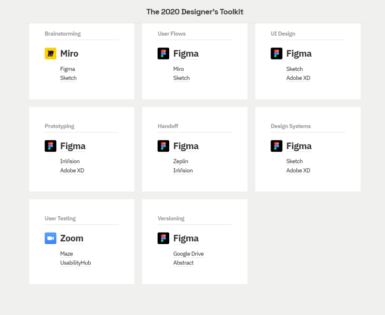
Source example: 2020 Designers Toolkit: https://uxtools.co/survey-2020/
Mediahuis needed to create consistency, improve efficiency and ensure scalability. Pàu lent its expertise, talent and advice to help achieve this. Brand recognition is ensured across the board with a single source of truth. And all of this in a multi-brand environment.
